HELLO.
NICE TO MEET YOU

4
LANGUAGES
QUADRILINGUAL
11
YEARS
EXPERIENCE


ABOUT ME
香港出身で2015年にワーキングホリデーで来日し、現在は日本国籍を取得しています。広東語を母語とし、日本語・英語・中国語を話せるマルチリンガルです。専門学校と大学を卒業し、香港で約2年間Webデザイナーとして勤務した後、現在は大阪でUIデザイナーとして活動しています。
11年の経験で、多言語・大規模サイトに強いUIデザイナーです。直近7年間は株式会社ミツエーリンクスにて、大手企業の日本およびグローバルサイトのUI/UX改善・多言語対応に携わり、CV率や売上の向上に貢献しました。また、デザインだけでなくチーム管理や改善提案にも取り組んできました。多文化理解と国際的な視点を強みに、柔軟に価値を提供できます。


MY WORKS

iphone accredit the author:
CASE 03
YES Pay – クレジットカード連携型電子マネーサービス(自主制作)
期間
2週間
チーム構成
個人制作(1人)
DETAILS
背景・課題
アプローチ・工夫点
メインカラー
クレジットカードと連携できる電子マネーサービス「YES Pay」の仮想商品を想定し、ユーザー獲得に向けたランディングページを制作。以下のような課題に対し、魅力を訴求しCV(登録)へとつなげる構成が求められました:
-
サービスの信頼性や実績が伝わりづらい
-
ユーザーのメリットが瞬時に理解されない
-
登録へつながる導線設計が弱い
1. 情報設計の工夫(信用 × 論理 × 行動喚起)
-
ファーストビューにスマホUIを大きく配置し、「スマホだけで完結する手軽さと利便性」をビジュアルで訴求
-
信頼性を補強する実績・メディア掲載情報をMV直下に設置し、実績や満足度などの訴で「強さ」を伝える
-
中盤には、特徴やメリットを論理的に整理した説明セクションを配置し、サービスの魅力を理解・納得してもらう構成に
2. ビジュアル設計の工夫
-
スマートフォン画面を活用した「カード残高・履歴が一目で見える」デザインで機能性を表現
-
「安心・便利・わかりやすい」イメージを伝えるインパクトのあるキャッチコピーを設置
-
トーン&マナーはミニマル・信頼感重視。カラーと余白設計で視認性も最適化
-
CTAエリアは閲覧者の心を揺さぶるキャッチコピー、立体的でよく目たつボタンを配置
ブランドカラーを基調に、明るく親しみやすい印象に仕上げました。

使用ツール・技術
Photoshop:ビジュアル素材の作成
Adobe XD:ワイヤーフレーム・デザインカンプ制作
Webflow:デザイン実装(ノーコード)
目的・KPI
-
登録コンバージョン率(CVR)の最大化
-
初見ユーザーに「便利で信頼できるサービス」という印象を与える
BtoCのランディングページ制作を想定し、限られた時間の中で「UXと視覚訴求のバランス」を重視しました。
BtoB制作で培った情報構造力を、より消費者目線で展開した挑戦的なプロジェクトです。
制作の意図
担当範囲
-
UX設計
-
UIデザイン
-
実装(Webflow)
キーワード
-
導入メリットが明確
-
信頼性の高い体験


クレジットカードがスマートフォン内に収まっているビジュアルで「管理のしやすさ」「履歴の見やすさ」「安心して使える印象」を直感的に伝え、ユーザーが利用シーンをイメージしやすいように工夫しました。
文字だけでなくアイコンも活用することで、ユーザーがひと目で商品の特長を理解できるように設計。視認性と訴求力を高め、スムーズにカタログダウンロードへと誘導します。

CASE 02
大手企業の既存商品ラインアップページ リニューアル
期間
約6ヶ月
チーム構成
デザイナー:1名(自身)
コーダー:4名
ディレクター:1名
DETAILS
背景・課題
アプローチ・工夫点
メインカラー
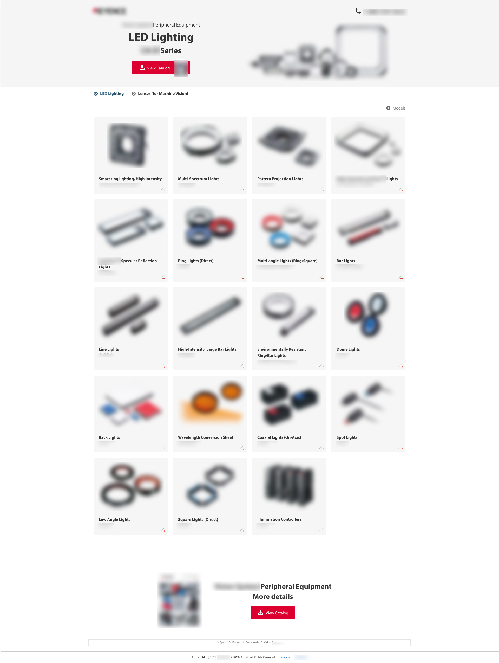
既存商品のラインアップページは、情報量の多さや構成の複雑さにより「比較のしづらさ」「目的情報への到達しづらさ」といった課題を抱えていました。
また、対象となるカテゴリが2系統存在し、ページ内でのスムーズな回遊も求められていました。
1. 情報設計の改善:探しやすく、比較しやすく
-
従来は縦長の構成で情報に辿り着くまでのスクロール負荷が高かったため、商品サムネイルをファーストビューから多数見せる構成に変更(1列2個→4個)
-
ユーザーに不要なグローバルナビなどを削除し、目的情報への最短導線を確保
-
各カテゴリ間をページ内でスムーズに行き来できる構成を設計し、比較体験を強化
2. デザインの工夫:シンプルで視認性の高いビジュアル
-
全体は落ち着いたグレートーンで設計し、商品自体が引き立つように調整
-
カテゴリの「現在地」を明確にするため、アクセントカラー(青)を使用して選択状態を強調
-
商品画像や説明は視覚的に整理され、見やすく・比較しやすいUIを実現
お客さんのイメージに合わせ+
商品を目立たせたく、薄いグレーで全体落ち着くトーンにし、カレントは青で強調します。

目的・KPI
使用ツール・技術
-
商品の魅力をより直感的に伝えるUIへの改善
-
カタログダウンロード数の増加
-
お問い合わせ件数(CVR)の向上
-
商品比較をしやすくし、離脱率の低下を図る
Photoshop:図版制作、UIデザインカンプ、パーツ設計
モジュールデザイン:コーダーとの連携を意識したコンポーネント設計
成果
担当範囲
リニューアル後は、カタログDL数やお問い合わせ数(CVR)が前年比5%以上の改善が見られ、クライアント社内・顧客双方から高い評価をいただきました。
また、作成したデザインは日本語を含む30以上の言語に展開され、グローバル展開にも大きく貢献しました。
-
情報設計(導線・コンテンツ構成)
-
UIデザイン(デザインカンプ制作)
-
多言語対応図版の制作(30言語以上)
キーワード
-
シンプルで洗練
-
直感的にわかりやすい

リニューアル前の課題:
既存ページは左右にグローバルナビゲーションが表示されており、情報量が多く、ユーザーの視線が分散しやすい構成でした。
また、ページ全体がテキスト中心だったため、「商品を素早く見つけたい」というユーザーにとっては、情報を読み解くのに時間がかかり、目的到達までの負荷が高い設計になっていました。
改善内容と効果:
商品の一覧性を高め、外観で区別しやすいレイアウトに変更することで、ユーザーが興味のある商品をすぐに見つけやすくしました。
不要なナビを削除し、シリーズ全体がひと目で伝わるビジュアルを上部に配置。さらに、左のタブでカテゴリ切り替えができるようにし、比較しやすい導線を設計しました。

CASE 01
大手企業の新商品特化ページ
期間
約2ヶ月
チーム構成
デザイナー:1名(自身)
コーダー:1名
ディレクター:1名
DETAILS
背景・課題
アプローチ・工夫点
メインカラー
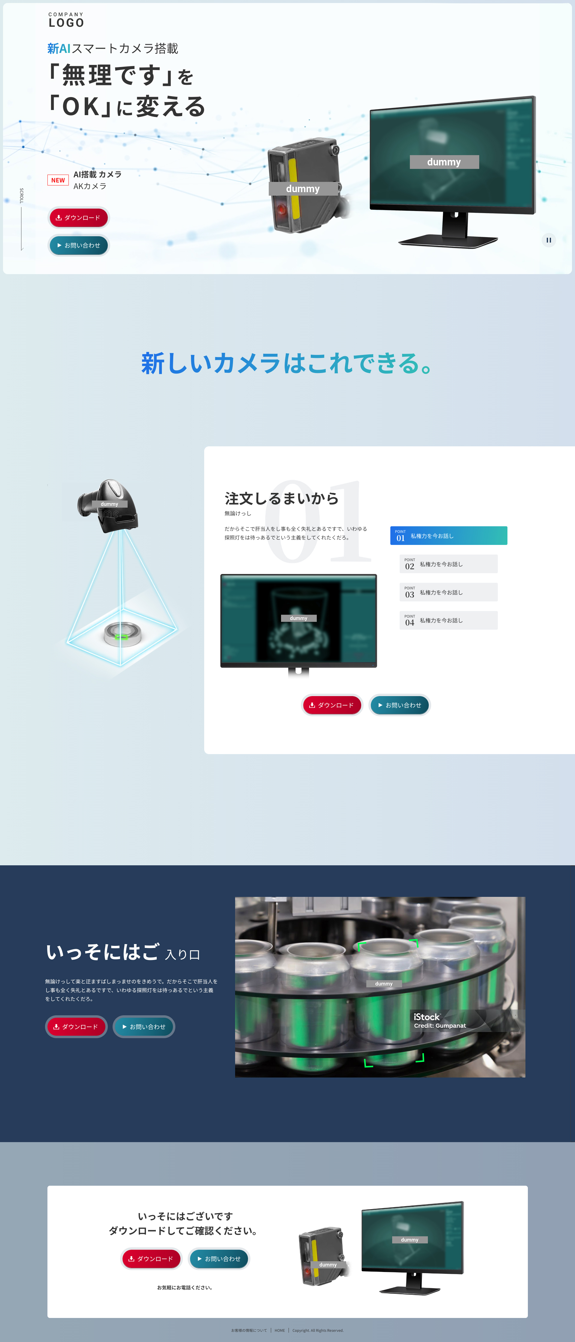
クライアントの新商品リリースにあたり、その製品に特化したランディングページ(LP)を新規制作しました。
製品は第4世代となる進化型モデル�であり、新たに搭載された「AI機能」を強みとして、以下のニーズに応える構成が求められました:
-
新規顧客への魅力訴求・獲得
-
既存ユーザーへのバージョンアップ促進
1. 情報設計:論理 × 行動導線
-
ファーストビューに背景動画+メッセージで製品の進化を視覚的に印象付け。
-
次に特徴や利点を段階的に紹介
-
CTA(ダウンロード・問い合わせ)を適切な間隔で挿入し、スムーズな行動導線を構築
2. ビジュアルデザインの工夫
-
自動再生動画により「プロフェッショナルな印象」と「技術力の高さ」を強調
-
新機能は視覚的に伝わりやすい構成にし、短時間での理解を促進
-
前作LPとの差別化を意識し、明るめの配色とAI感のあるグラデーションで未来感と視認性を両立
前のバージョンは緑系の色を使ってましたので、青近い色に選択しました。

使用ツール・技術
目的・KPI
Photoshop:図版作成・画像処理
Adobe XD:UIデザインカンプ作成
After Effects:ファーストビュー動画制作
-
カタログダウンロード数の増加
-
お問い合わせ件数(CVR)の向上
-
製品の進化ポイント・価値を明確に伝えること
成果
担当範囲
リリース後は、カタログDL数や問い合わせ件数が増加し、クライアント社内・エンドユーザーの双方からデザイン性・訴求力ともに高い評価をいただきました。
-
情報設計(構成・導線設計)
-
UIデザイン(デザインカンプ制作)
-
ファーストビューの動画演出(After Effects使用)
キーワード
-
明るい
-
AI
-
賢い
-
クール


メインビジュアルでは、AI搭載という特長を強調するため、テクノロジー感のあるパーティクル・ウェーブの背景を用いて、直感的に先進性を伝える演出を加えました。
このセクションでは、従来製品との進化点を直感的に伝えるため、現場での測定シーンを想起させるような動きで紹介しています。ユーザーが①ナビから特徴1〜4を選択すると、②測定対象が切り替わり、③製品がスキャンを行いながら、各特徴の説明と測定画面が連動して表示される仕組みにしています。

MY OTHER PROJECTS


※守秘義務の都合上、実際の企業名・製品名・ビジュアル・テキストの一部はダミーで構成しています。
Due to confidentiality agreements, some company names, product visuals, and texts are replaced with placeholders or dummy content.
DESIGNER
1
DIRECTOR
1
PROGRAMMER
4
Members involved In this project
MONTHS
6
Duration
CASE 02
商品の既存ラインアップページをリニューアルし、よりユーザーが使いやすくLPを制作しました。リニューアル通して達成したいゴールは各商品の比較のしやすさをあげ、カテゴリは2つの商品があるため、このページ内で行き来が可能にしたいとなります。また、商品の詳細の下層が大量にあり、モジュールを作成しコーダーさんと連携した展開をしました。リリース後はCV率が上がり、社内とお客様からにも好評をいただきました。そして、日本語以外も30言語以上の展開をしました。(守秘義務のため、商品とテキストもダミーのものになります。)
Renewing our client's product line-up page, I was assigned to design a page in order to increase the usability. The goal of the page is to higher the ease of comparison of the products and user can easily change and view the categories of the products. (As there is a confidential disclosure agreement between my company and my client, the demonstrated products or texts in the image is in dummy version.)
accredit the author:
iphone accredit the author:

DESIGNER
1
2
WEEKS
Duration
Members involved In this project
自主制作の仮想商品、クレジットカードを連携できる電子マネーサービスとページをデザインしました。サービスをユーザーに勧めるため、特徴、メリットをわかりやすくユーザーに伝えるページです。
This is an exercising page which objective is to promote the product named as YES Pay. The goal of the page is to increase the CV rate (user to download and install the application) and to deliver the benefits to the users.
CASE 03
従来の商品と違って、進化したところをこのセクションでよりユーザーがわかりやすくするため、実際現場で作業し測定するような動きを加えて紹介します。ユーザーが①のナビで特徴1から4を選んでもらい、②測定物が入れ替わり、そして商品がスキャンすると、③各特徴の説明文と測定画面が切り替えます。
メインビジュアルの背景はAI搭載してる売りを強調し,テクノロジー感の演出があるparticle waveでアピールします。

DIFFERENCES
MVからAIを連想する動画を配置し、タイトルや商品の置き方はダイナミックでよりユーザーに印象残ります。
前のバージョンは緑系の色を使ってましたので、青近い色に選択しました。
MAIN COLOUR
KEYWORD
・明るい
・AI
・賢い
・クール
DETAILS
CASE 01


CONCEPT
商品が多く、縦が長くてスクロールしないと辿り着かない、比較し難いのは既存のページの問題です。今回のリニューアルで見やすさを改善し、商品の探しやすさを改善し、詳細見て次の商品と比較しやすいのを考えてみました。ページに入った瞬間に、商品のサムネイルを大きくアピールし、1列2個から4個に増やして、ファーストビューから多く数の商品を見せたいデザインにしました。
There are various products displaying in the page. However, user cannot compare the products easily if they don't scroll and could not notice the products at the bottom as the page was very long. I decided to modify the size of thumbnail, the number of the products in first view etc, in order to improve the ease of use of the page.
・シンプルで洗練
・外観で区別
・より見やすい
KEYWORD
MAIN COLOUR
お客さんのイメージに合わせ+
商品を目立たせたく、薄いグレーで全体落ち着くトーンにし、カレントは青で強調します。
既存のページにサイト全体ナビなど、ユーザーには要らない情報をとり、商品の見せ方を改善し、より早く欲しい情報に辿り着くレイアウトをデザインしました。
DIFFERENCES

既存のページは左右両方にサイトのナビがあり、情報が多すぎてユーザーがこちらの商品に集中しにくいです。また、テキストをメインにし、早く商品を探したいですが、文字読むに時間がかかります。
見せ方を改善し、より多く数の商品を並び、商品の外観ですぐ区別でき、ユーザーが興味ある商品はすぐ押してもらい、比較しやすいページになりました。要らないナビをとり、上にビジュアルでユーザーにこのシリーズの商品を見てることを明確し、左のタブで商品の二カテゴリの切り替えもできるように改善しました。
Product accredit the author:


MY OTHER PROJECTS

ビジュアルでクレジットカードがスマートフォンの中にあるイメージして、管理しやすく、記録もあり、安心して使える、より想像しやすくユーザーに伝えます。
文字のみよりアイコンを使い、パッと見た瞬間にユーザーがこの商品のいいところを理解し、ダウンロードを誘導します。
商品のブランドカラーに合わせ、全体明るい印象を与えます。
MAIN COLOUR
・メリットが多い
・安全感
・わかりやすい
KEYWORD
スマートフォン一つだけで全て完結できる!という考えから始まり、便利さ、管理しやすく安心で使えるイメージキャッチコピーとメインビジュアルで表現し、メリットもいっぱいで設定は簡単で誰でも使える商品とユーザーに勧めるページと考えます。
To deliver the measure "You can do all the things within you smartphone", the visual and copy of the page is bring an image of convenient, easy to manage and secure to the users. Recommending the product by telling users everyone can easily use it.
CONCEPT
大手企業の新商品特化ページ
期間
約2ヶ月
デザイナー:1名(自身)
フロントエンドコーダー:1名
ディレクター:1名
チーム構成
クライアントの新商品リリースにあたり、その製品に特化したランディングページ(LP)を新規制作しました。
製品は第4世代となる進化型モデルであり、新たに搭載された「AI機能」を強みとして、以下のニーズに応える構成が求められました:
・新規顧客への魅力訴求・獲得
・既存ユーザーへのバージョンアップ促進
背景・課題
約2ヶ月
期間
・カタ�ログダウンロード数の増加
・お問い合わせ件数(CVR)の向上
・製品の進化ポイント・価値を明確に伝えること
目的・KPI
・情報設計(構成・導線設計)
・UIデザイン(デザインカンプ制作)
・ファーストビューの動画演出(After Effects使用)
担当範囲
MY WORKS
HOW TO FIND ME

お気軽にご連絡ください。これまでの制作実績を詳しくご紹介いたします。
ご連絡は kaijo.gary@gmail.com ま��たは下記のLinkedInアカウントまでお願いいたします。ありがとうございます。